From unknown visitor to quality lead: the landing page is the gateway to getting more customers through your online channels. Visually and textually, there are an awful lot of elements you can use to open that gate invitingly.
You want your online channels to contribute to getting more leads for sales. A good landing page does what it needs to do: convert an unknown visitor into a lead, or invite an existing contact to provide more information about themselves. The knowledge you share in return helps that person learn about your company and/or products/services in an approachable way. Moreover, with the information gained, you can lead him or her further through the sales funnel in a non-disruptive (inbound) way.
In this blog, I break down the anatomy of a converting landing page into 3 parts: persuasion, optimization and finally the complements. By the end of this blog, you'll be an expert at setting up landing pages that convert visitors into quality leads that make sales very happy!

Part 1: persuasion
The landing page below has been carefully chopped up. We take this landing page as an example. How do the pieces together ensure success?
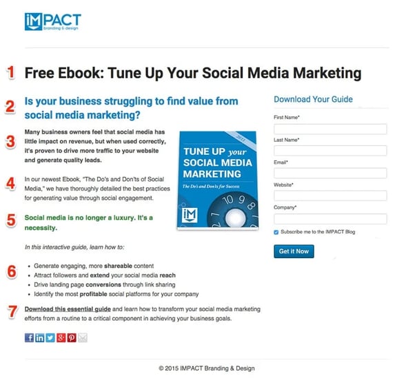
1. H1 (title).
A good landing page should almost immediatelyremove alldoubt as to whether the visitor is on the right page. Therefore, in the H1 title, repeat (part of) the name of the downloadable offer. Thanks to the addition that the offer is free, this title immediately catches the eye.
2. H2 (title)
The person sitting on your landing page clicked on the call to action because he was addressed in a particular "pain." What is he struggling with? What is keeping him from achieving certain goals? Unlike the H1 title, the H2 title is recommended to address this pain. Try to keep functional language to a minimum.
Moreover, askinga question is very powerful. It forces the reader to think critically about their own situation.
3. Introduction
The text that follows supports the H2 title andelaborates onthe problem - and why you would want to solve it. Again, in this section of the landing page, emphasize describing the overall pain:social media has no impact on the organization's revenue, whereas if used correctly, it generates more traffic and quality leads!
4. The offer
Only now is it time for functional language. Make space on the landing page for a new paragraph in which you elaborate on the benefits of the downloadable offer. Again, keep it short.
5. Quote/statement.
"Social media is no longer a luxury. It's a necessity" definitely catches the eye. If necessary, place aquote or statement ( preferably contrasting) that serves as an elevator pitch for the offer.
6. Bullet points
An absolute best practice for your landing page are bullet points that describethe content and/or benefits of the offer to be downloaded. Bullet points:
- Are short and to the point
- Make the text scannable
- Stand out in the text
This section of the landing page should confirm what the recipient gets in exchange for their data. The content of this piece should remove any doubt (what I'm about to read is really of value) and make the reader hungry for more (they know something I don't).
7. And. action!
The conclusion of the text should absolutely spur action. Briefly restate the main goal the recipient has in mind: the person who downloads this E-book will not only get better at social media marketing but will start meeting business goals. Who doesn't want that?
Then close with actionable verbs like, "download, learn, discover, see, transform."
Part 2: optimize
In the second part, optimize the landing page so that all the elements on the page work together to ensure that the prospect downloads the offer and leaves their data.
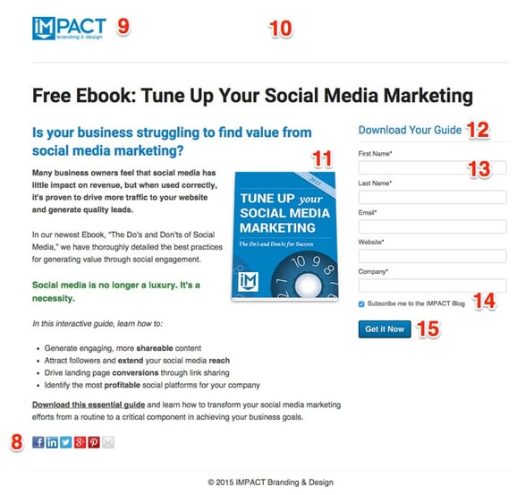
8. Social sharing buttons
Spread your chances of winning; make it possible for the reader toshare this landing page with colleagues or associates. Personally, I find it stronger if the social sharing buttons are only placed on the next page (the thank you page), as these buttons only distract.
9. Logo
Use this space by placing your logo and company name.
10. No distractions
It is essential that the visitor on the landing page converts into a lead. Therefore, you will need tominimize distractions on the page. Remove any buttons that may cause the recipient to navigate away from the page.
11. Visual offer
If possible, make the offer visual on the landing page. The image of the booklet allows the recipient to immediatelypicture what they are about to receive. This makes it tangible and removes any doubts. In addition, a good design increases the value of the landing page.
12. Form title
The form is clearly marked with a title that encourages action:download your guide!
13. Form
The form on the landing page is essential: this is where the actual action will take place. The length of the form should be in line with the value of the offer and the stage of the buying process.
Stage in the buying process: you don't want to scare off someone who is about to leave their details with you for the first time with a form that is too long. That almost feels like signing a signature!
A visitor who reveals his name, e-mail address and perhaps company on the landing page already provides very valuable information. When that person wants to download something again at a later time you can ask for additional information.
Value of the offer: giving away your data is not something you do lightly. Therefore, avoid disappointment and adjust the length of the form to the offer the person receives in exchange.
For example, in exchange for a simple top-of-the-funnel E-book, don't ask for too much data. However; someone who shows high activity and requests a demo of your product is clearly a lot "lower" in the funnel. Asking for a phone number or position (role in the organization) is appropriate here.
In general, you can ask for the following information on the landing page:
Top of the funnel
- First name
- Last name
- Email address
- Function/Role
- Company name
- Company website
Bottom of the funnel
- Country
- Phone number
- Number of employees
- Sells primarily B2B or B2C
- The one's biggest challenge
14. Lead nurturing
Ideally, you want to send content on a regular basis to further guide the new lead through the funnel. Therefore, place a box to sign up for the newsletter or blog updates andfill in the checkbox in advance.
15. Button
The button absolutely must stand out and trigger action. Provide a contrasting color that catches the eye.
3. Powerful additions
You can also add elements on the landing page that reinforce the offer.
Testimonials
What is missing from this page are testimonials from customers or readers who appreciated the E-book. For example:
- A counter showing that many people have already downloaded the E-book to their satisfaction
- Quotes / statements from customers or readers
A good testimonial gives a sense of urgency (I don't want to miss the boat). Through testimonials you can also build trust, by making apromise that the downloadable offer is of value.
Try before you buy
People like to be sure that the content of what they are about to download is valuable. So you can offer the first pages of the offer in the form of a preview.
Video
Everyone absorbs content differently. So you can consider wrapping the description of the offer and/or the testimonial in a video.
Smart forms
When someone has left their information before and now comes back to a different landing page, it is very strong if yougreet thempersonally with smart forms.
Smart forms pre-populate the person's already retrieved data. More personalization can also be applied in the text.
See below an example of one of our landing pages where my data is already filled in. This makes the threshold to just fill in my phone number a lot lower.
Awards/reviews/partners
Don't hesitate to show awards won, partnerships or high scores from tests. This again gives the feeling that you are a party that people can trust.
Contact details
If necessary, make space on the landing page for contact information for an account manager. Include a photo, as this immediately gives the feeling that you are dealing with a real person. Make sure these contact details cannot be clicked through that navigate away from the landing page.
Creating landing pages with HubSpot
Tip: HubSpot ' sMarketing and Sales software helps you create excellent landing pages that are completely consistent with your current website inlook and feel.
The lead-scoring landing page
Of course, you don't always have a designer or web builder at your disposal to optimize the landing page, but textually you can already make many small adjustments that significantly increase conversion.
The most important take-away
Always make sure you have in mind what goal you want to achieve and to whom you are speaking. When you offer valuable content that naturally draws people to your site (aninbound marketing or pull strategy), the landing page is just a formality.
Good luck in creating a landing page that is going to provide quality leads that make sales happy!